.png)
How to Brand Your Amazon Store and Stand Out from the Crowd

It’s interesting to see how Amazon (and Amazon customer behavior) has evolved in the last few years. While the marketplace has been a major source of growth for independent sellers, the addition of Amazon Stores as an option for private labels and other registered brands has been a game-changer.
Being able to create your own branded store—granted, within the constraints of Amazon’s segmented design parameters—is something that every seller should take full advantage of. We’re going to walk step by step through each customizable element of a typical Amazon Store and view examples of how different sellers use Amazon’s modular design for their unique needs.
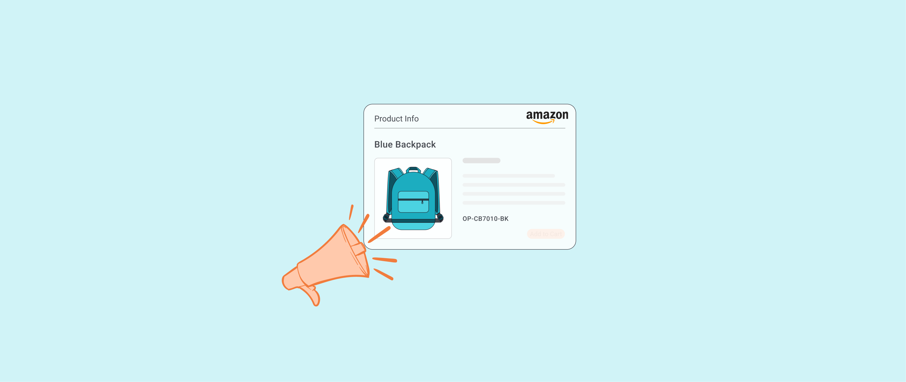
Hero Image
Let’s start here. The hero image is the first thing your customer will see when they visit your Amazon Store. As such, the impression it leaves should be carefully considered.
Every Amazon Store has a hero image. Depending on your creative and branding goals, there are a few approaches you can take:
- Option 1: You could showcase your product in action so that customers get a quick demonstration of its utility and desirability
- Option 2: If your goal is to create an omnichannel brand presence that’s aligned across Amazon, your social media and your website, the hero image should use some combination of logo, font, colors or textures associated with your brand identity
- Option 3: If you sell an experiential-related product or a certain state of mind, perhaps your goal should be to convey that experience within the hero image
Let’s look at three examples, one each of these different hero images.
Product in Action

EzPacking is a travel and lifestyle organization brand with a focus on packing cubes for organizing things like toiletries, clothing and other items that normally get shoved into a suitcase when you go on a trip. It makes sense for them to show you what a product in use looks like because the main selling point of the brand is its ability to cure the pain and inconvenience of having a disorganized or cluttered suitcase. The neatly stacked and organized cubes express this concept the moment a customer clicks into the Amazon Store.
Omnichannel Branding

Nike has one of the most recognizable logos (and brands) in the world. For a bigger brand like this, it makes sense that they’d use the hero image to remind customers that even though they’re shopping on Amazon, they are clearly doing business with Nike. Interestingly, the background color on Amazon is several shades darker but still within the same color families of the background photos on their website’s home page (at least as of March 2020).
Most merchants that sell on Amazon don’t have the globally recognized power of the Swoosh in their corner, but if Amazon is not your main focus—for example, you operate a standalone ecommerce website that gets the bulk of your traffic—then that’s reason enough to opt for a clean logo look that reinforces your brand’s identity on Amazon.
State of Mind

Not all products on Amazon are photogenic. Case in point: Whistler sells products like radar detectors, dash cams and other items meant to protect drivers from liability in case of an accident or speeding ticket.
An ecommerce company like this is selling an experience more than a product. If you’ve ever watched an ad for workout equipment or the latest fad diet, you’ve seen muscular, fit people sell the AbCrusher3000 or keto shakes because the point of the product imagery is to make the consumer aspire to achieve a certain look, rather than enjoy the actual workout or chalky protein powder.
Whistler’s hero image is selling peace of mind for this exact reason. There’s nothing sexy or exciting about a radar detector or dash cam. But what about winning an insurance claim when someone runs a red light and hits your car? That’s what this hero image conveys.
Menu
The menu is probably the least intuitive part of branding for your Amazon Store, but it can be done. What does a brand-conscious menu look like? There are two things you can do to brand your menu.
Don’t Just List Products

A really clever branding method that you can deploy is listing out beneficial traits of your products. The old marketing axiom “benefits, not features” means that you should ask yourself what your customers are looking for when they decide to go directly to your store instead of searching on the broader marketplace for a particular item. When that happens, the menu will be the second thing they see after the hero image. It’s an opportunity to make a positive impression and tell the customer about your brand.
An endorsement from a trustworthy reviewer such as Consumer Reports is invaluable. In the example above, the addition of CR’s glowing reports on Honeywell’s Amazon Store tells potential customers that they’re looking at a brand that doesn’t skimp on quality.
Endorsement such as this also implies that your products may not beat the competition on price, but will win on value. Especially if you’re trying to position yourself as a premium product seller on Amazon, using the menu to subtly alert shoppers to expect a higher price might pleasantly surprise them when they actually see what it costs.
Make Popular Items More Prominent

If a shopper comes to your store and has a good idea of what they want to buy, adding best-selling and most popular items in the menu helps them find what they might be looking for faster. That’s not explicitly good branding, but it does make for a more helpful UX.
In the above example from portable power company Jackery, we see that their menu leads off with their most popular products (generators, power stations and solar panels). They dedicate the last two tabs on their menu to value proposition pages, knowing that a customer who is still in the research phase of shopping may want answers to these types of FAQs. However, it’s not an accident that their bestsellers anchor this section of their store.
Since Amazon shoppers must first search for a product, then click on a specific product and finally click on the link to the product’s store, a relatively high proportion of shoppers are making this journey with a conscious intention to buy or do serious product research. Why wouldn’t you want to make it easier for them to discover your most popular items?
Step 1: Search for solar generator on Amazon

Step 2: Click on Jackery solar generator bundle to view the product page

Step 3: Click on “visit the Jackery store” and arrive at their store

Product Images and Videos
Below the hero image and menu is where the meat and potatoes of your Amazon Store live. It’s typical to see some combination of glamour product shots with more standard ones that depict your products without any fuss. Adding a video of the product being used isn’t a bad idea, either.
Show, Don’t Tell

What we see in this example from phone and tablet accessories company Aukey is a combination of all three elements of visual media: a glamour shot of a sweaty guy working out with his earbuds prominently displayed; a video of another guy casually vibin’ with his earbuds; and finally, two simple shots of the same product in different colors.
Aukley does a good job of representing actual, everyday use of the product they sell, and then, of course, they make sure to include some standard product stills against a white background per Amazon requirements,
The whole point of product photos and videos is to convey the benefits of buying your product without having to say a word. If you sell inflatable beds, show people comfortably sleeping in them. If you sell running shoes, show people running while wearing them (or looking especially cool while lounging around in their living room).
Aukey achieves a good balance by incorporating multiple types of imagery without any single one overwhelming the others.
Inspire Confidence

More and more people expect quality when they buy from Amazon sellers. But there is still good reason for them to worry because fraud and counterfeit items do exist on the platform. Your Store’s branding should make people trust the products you sell.
German cutlery company Wusthof has an outstanding product video on its homepage that is ideal for the purposes of selling on Amazon. There’s an emphasis on showing how their high-end blades are fabricated. You see steel being smelted and people in lab coats testing for quality. Over and over again, the company’s 200 years of mastering the craft is emphasized.
Showing the production process in videos like this is a great way to build trust in your product, as well as connect shoppers to the names and places behind the product they are looking at. Take your customers inside the factory or the design room or the lab.
Of course, the vast majority of items for sale on Amazon are not made by fourth-generation family-owned companies based in storied German towns with thousands of years of documented craftsmanship. You might not want to give customers a behind-the-scenes tour of your mom’s basement or the factory in Guangzhou that you found thanks to Alibaba. But you can still convey quality and trust. How?
Diagrams and close-ups are your friends. They can give a seemingly ordinary product a bit of scientific gravitas. Nothing says “this product was engineered by someone with a PhD” like adding some arrows or picture-in-picture elements to a product shot. The copy that accompanies images like this shouldn’t be as stupefyingly boring as an instruction manual, but you can drop a bit of jargon or technical terms as needed. Duramont, which sells ergonomic office furniture, achieves this effect on their store page by adding photos like this one into the mix (and they’re not afraid to be a little cheeky with their copy either).

Best Sellers, Recommended Products, Retargeting… and Then What?
The final section of your store, below the product images and videos, is usually a smattering of best-selling products and content that appears by default once a customer scrolls to the bottom of the page.
If a customer has spent time browsing, hopefully, they’ve learned a thing or two by the time they’ve made it to this part of the page. They may have a better appreciation for the quality and attention to detail you’ve put into your product. They may even be excited at the thought of owning your product after watching a video of someone using it.
They may also not be sure at all if they want to buy anything from you. This is a good opportunity to retarget them or at least suggest similar products that they might be interested in, because you won’t know for sure when they’ll be back.
Similar posts